Mattermost 記事まとめ: https://blog.kaakaa.dev/tags/mattermost/
本記事について
Mattermost の統合機能アドベントカレンダーの第 20 日目の記事です。
本記事では、Mattermost 上の様々な操作に対応した処理を追加できる Mattermost Plugin のWebappサイドの機能を紹介していきます。
記事が長いので 2 日に分けて紹介していきます。それでも長いです。
Mattermost Plugin についての公式ドキュメントは下記になります。 https://developers.mattermost.com/extend/plugins/overview/
サンプルコードは下記リポジトリにコミットしています。 https://github.com/kaakaa/mattermost-plugin-api-sample
Mattermost Plugin (Webapp) について
Mattermost Plugin (Webapp) の本体について紹介します。
Mattermost のWebappサイドの Plugin を実装する場合、プラグイン本体はregistryとstoreを引数にとるinitializeメソッドを持つクラスです。registryは Mattermost Plugin (Webapp)の機能を呼び出すためのメソッドを持つオブジェクトで、storeは Mattermost のデータにアクセスするためのインターフェースです。
公式ドキュメントでは、以下のようなPluginClassが紹介されています。
https://developers.mattermost.com/extend/plugins/webapp/reference/
class PluginClass {
    /**
    * initialize is called by the webapp when the plugin is first loaded.
    * Receives the following:
    * - registry - an instance of the registry tied to your plugin id
    * - store - the Redux store of the web app.
    */
    initialize(registry, store)

    /**
    * uninitialize is called by the webapp if your plugin is uninstalled
    */
    uninitialize()
}
このPluginClassのインスタンスをwindowオブジェクトが持つregisterPlugin関数に Plugin ID と共に与えることで、Plugin が有効になります。
window.registerPlugin("myplugin", new PluginClass());
Webapp Plugin API
registerRootComponent
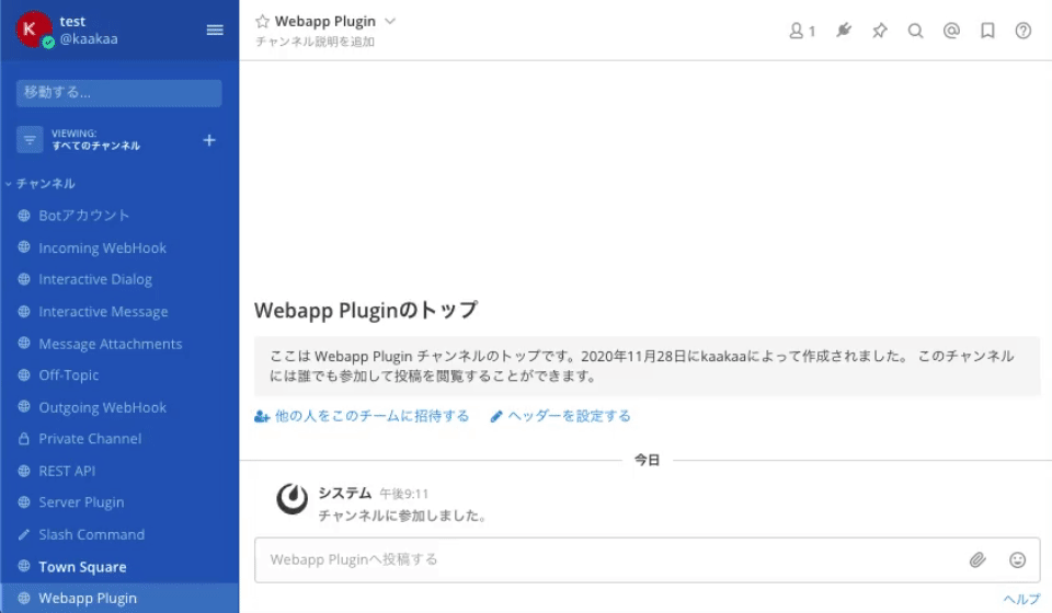
registerRootComponentは、画面全体に表示されるモーダルの React Component を登録する API です。Component が登録されると、Component を一意に識別するための ID が返却されます。
ここで登録した Root Component は、登録するだけで表示されるわけではなく、別のアクションから起動されることで表示されます。
登録された Component で使用できる props は特にありません。channel_controller.jsx
今回は、チャンネルのヘッダー部分にボタンを追加するregisterChannelHeaderButtonAction API を使って Root Component を表示する例を以下に示します。全てのプログラムを記述すると非常に長くなってしまうため、Redux によるデータのやりとりなど部分については本記事では割愛します。プログラム全体について知りたい場合は、kaakaa/mattermost-plugin-api-sample
また、Mattermost 公式チームにより作成されているデモ用プラグインmattermost-plugin-demoの実装も参考になります。
...

import {openRootModal} from './actions'
import reducer from './reducer';

import Root from './components/root';

...

export default class Plugin {
    initialize(registry, store) {
        // (1) Root Componentの登録
        registry.registerRootComponent(Root)

        // (2) Root Componentを呼び出すアクションの登録
        registry.registerChannelHeaderButtonAction(
            channelHeaderButtonIcon,
            () => store.dispatch(openRootModal()),
            "Open Root modal","Open Root modal"
        );

        registry.registerReducer(reducer);
    }
}
上記の例では、(1)で Root Component となる React Component を登録し、(2)で Root Component を表示するアクションをチャンネルヘッダーボタンに与えています。(2)のstore.dispatch(openRootModal())が Root Component を表示する処理ですが、これは Root Component を表示する state を流す処理になります。
Root Component は以下のようなコードであり、visible = trueとなることで画面に表示されます。
import React from "react";

const Root = ({ visible, close }) => {
  if (!visible) {
    return null;
  }

  const style = getStyle();

  return (
    <div style={style.backdrop} onClick={close}>
      <div style={style.modal}>
        <p>Root modal</p>
      </div>
    </div>
  );
};

Root.propTypes = {
  visible: PropTypes.bool.isRequired,
  close: PropTypes.func.isRequired,
};

const getStyle = () => ({
  backdrop: {
    position: "absolute",
    display: "flex",
    top: 0,
    left: 0,
    right: 0,
    bottom: 0,
    backgroundColor: "rgba(0, 0, 0, 0.50)",
    zIndex: 2000,
    alignItems: "center",
    justifyContent: "center",
  },
  modal: {
    height: "300px",
    width: "500px",
    padding: "1em",
    color: "black",
    backgroundColor: "white",
  },
});

export default Root;
Root Component は React Component のため、様々な要素を表示することができますが、基本的には通知のために利用し、ユーザーに入力を促すようなユースケースの場合はInteractive Dialogを使用すべきだと思います。
registerPopoverUserAttributesComponent
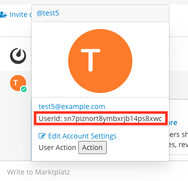
registerPopoverUserAttributesComponentは、ユーザーアイコンをクリックすると表示される popover 内に表示される Component を登録します。
Mattermost 外からユーザーの情報を取得して表示する際に使用できます。所属の名称がコロコロ変わる会社などで LDAP から所属を引いて表示しておくと便利です。
登録した Component は以下の props を受け取れます。profile_popover.jsx
user: popover で表示しているユーザーのオブジェクト- アクセスできるのはUserモデルで定義されている情報になると思います
Userモデルでomitemptyとなっているものは空の場合除外されるため、値がある場合のみアクセスできます
hide: popover を閉じる関数status: popover で表示しているユーザーの statusonline,offlineなどの単なる文字列のようです
ここでは、固定文字列を表示する例を示します。
...

import UserAttributes from './components/user_attributes'

...

export default class Plugin {
    // eslint-disable-next-line no-unused-vars
    initialize(registry, store) {
		...
        // (1) User Popoverに説明を追加するComponentの登録
		registry.registerPopoverUserAttributesComponent(UserAttributes)
		...
    }
}
import React from 'react';
import PropTypes from 'prop-types';

const UserAttributes = ({user, hide, status}) => {
    console.log("user", user.id);
    return (
        <div>
            <p>{'UserId: ' + user.id}</p>
        </div>
    );
}

UserAttributes.propTypes = {
    user: PropTypes.object.isRequired,
    hide: PropTypes.func.isRequired,
    status: PropTypes.object.isRequired,
};

export default UserAttributes;
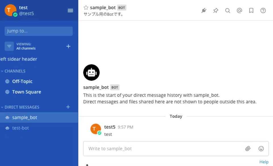
registerPopoverUserActionsComponent
registerPopoverUserActionsComponentは、ユーザーアイコンをクリックすると表示される popover 内に表示される Component を登録します。registerPopoverUserAttributesComponentと似ていますが、表示される位置が異なるだけの違いだと思います。
登録した Component は、registerPopoverUserAttributesComponentと同じく以下の props を受け取れます。profile_popover.jsx
user: popover で表示しているユーザーのオブジェクトhide: popover を閉じる関数status: popover で表示しているユーザーの status
registerPopoverUserActionsComponentで、RootComponent を表示する例は以下のようになります。(処理を一部割愛しているため、プログラム全体は https://github.com/kaakaa/mattermost-plugin-api-sample から確認してください)
...
import UserAction from './components/user_action';
...
export default class Plugin {
    // eslint-disable-next-line no-unused-vars
    initialize(registry, store) {
		...
        // User Popoverにアクションを追加するComponentの登録
		registry.registerPopoverUserActionsComponent(UserAction)
		...
	}
}
import React from 'react';
import PropTypes from 'prop-types';

const UserActionComponent = ({openRootModal, user, hide, status}) => {
	const onClick = () => {
		openRootModal();
		hide();
	};
    return (
        <div>
            <p>User Action <button onClick={onClick}>Action</button></p>
        </div>
    )
};

UserActionComponent.PropTypes = {
	openRootModal: PropTypes.func.isRequired,
    user: PropTypes.object.isRequired,
    hide: PropTypes.func.isRequired,
    status: PropTypes.object.isRequired,
};

export default UserActionComponent;
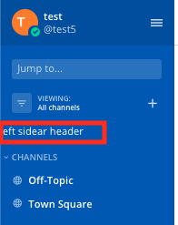
registerLeftSidebarHeaderComponent
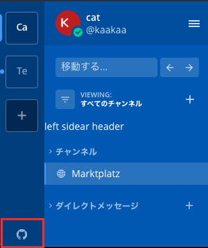
registerLeftSidebarHeaderComponentは、Mattermost 画面の左サイドバーに表示する Component を登録します。
登録された Component で使用できる props は特にありません。sidebar.tsx
常に表示されている部分のため、職場の室温や CO2 濃度などを表示するなどの利用方法があるかと思います。
...
import LeftSidebarHeader from './components/left_sidebar_header';
...
export default class Plugin {
    // eslint-disable-next-line no-unused-vars
    initialize(registry, store) {
		...
        // User Popoverにアクションを追加するComponentの登録
		registry.registerLeftSidebarHeaderComponent(LeftSidebarHeader)
		...
	}
}
import React from 'react';

const LeftSidebarHeaderComponent = () => {
	const style = {
		color: 'white',
	};
    return (
        <div style={style}>
            <p>left sidear header</p>
        </div>
    );
}

export default LeftSidebarHeader;
registerBottomTeamSidebarComponent
registerBottomTeamSidebarComponentは、チーム選択サイドバーの下部に表示される Component を登録します。1つのチームにしか参加していない場合、チーム選択サイドバー自体が表示されないため、ここで登録した Component も表示されません。
登録された Component で使用できる props は特にありません。legacy_team_sidebar_controller.tsx
...
import BottomTeamSidebar from './components/bottom_team_sidebar';
...
export default class Plugin {
    // eslint-disable-next-line no-unused-vars
    initialize(registry, store) {
		...
        // User Popoverにアクションを追加するComponentの登録
		registry.registerLeftSidebarHeaderComponent(BottomTeamSidebar)
		...
	}
}
import React from 'react';

const BottomTeamSidebarComponent = () => (
    <>
        <a href="https://github.com/">
            <i
                className='icon fa fa-github'
                style={{color: 'white'}}
            />
        </a>
    </>
);

export default BottomTeamSidebarComponent;
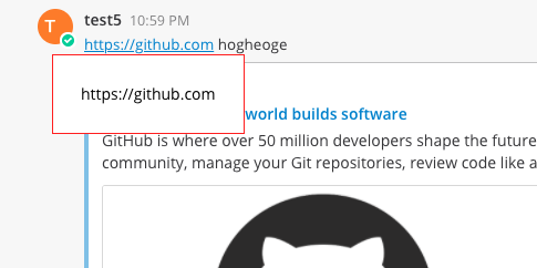
registerLinkTooltipComponent
registerLinkTooltipComponentは、リンクを hover した時に表示される tooltip の Component を登録します。
登録した Component は以下の props を受け取れます。link_tooltip.tsx
href: hover しているリンクの URLshow: tooltip が表示されているかどうかのフラグ
以下の例では単に hover しているリンクの URL を表示しているだけですが、リンク先から情報を取得して表示するようなこともできます。
...
import LinkTooltip from './components/link_tooltip';
...
export default class Plugin {
    // eslint-disable-next-line no-unused-vars
    initialize(registry, store) {
		...
        // User Popoverにアクションを追加するComponentの登録
		registry.registerLinkTooltipComponent(LinkTooltip)
		...
	}
}
import React from 'react';
import PropTypes from 'prop-types';

const LinkTooltipComponent = ({href}) => {
    return (
        <>
            <p style={{
                backgroundColor: 'white',
                color: 'black',
                padding: '25px',
                border: '1px solid red',
            }}>
                {href}
            </p>
        </>
    )
}

LinkTooltipComponent.propTypes = {
    href: PropTypes.string.isRequired,
};

export default LinkTooltipComponent;
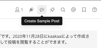
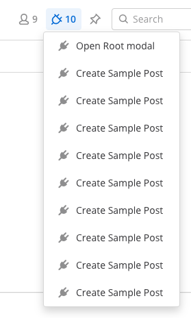
registerChannelHeaderButtonAction
registerChannelHeaderButtonActionは、registerRootComponentのところでも使用しましたが、チャンネルのヘッダ部分にアクション付きのボタンを登録します。
registerChannelHeaderButtonActionは、(icon, action, dropdownText, tooltipText)の4つの引数を取ります。
icon: ボタンのアイコンを表す React Elementaction: ボタンがクリックされたときに実行されるアクション- ボタンが押されたチャンネルの情報を持つ
channelと、ボタンを押したユーザーのchannelMemberを引数に取ることができます
- ボタンが押されたチャンネルの情報を持つ
dropdown_text: ボタンが複数登録されると一つのアイコンにまとめられ、ドロップダウンメニューから選ぶ形式になりますが、その時のドロップダウンメニューに表示される文字列tooltip_text: ボタンを hover した時に tooltip として表示される文字列
ボタン形式
ドロップダウン形式
ここでは、先ほどの Root Comopnent を開く Button と、クリックすると投稿を作成する Button の 2 つの Button を表示する例を示します。投稿の作成はmattermost-reduxを使って投稿を作成する actions を作成し、Channel Header Button の action から呼び出しています。
import {openRootModal, createPluginPost} from './actions';
import reducer from './reducer';
import Root from './components/root';

...

export default class Plugin {
    // eslint-disable-next-line no-unused-vars
    initialize(registry, store) {
        // Root Componentの登録
        const rootComponentId = registry.registerRootComponent(Root)

        // Root Componentを呼び出すアクションの登録
        registry.registerChannelHeaderButtonAction(
            () => (<i className='icon fa fa-commenting-o' style={{fontSize: '15px', position: 'relative', top: '-1px'}}/>),
            () => store.dispatch(openRootModal()),
            "Open Root modal","Open Root modal"
		);

		...

        // 投稿を作成するチャンネルヘッダボタンを登録
        registry.registerChannelHeaderButtonAction(
            () => (<i className='icon fa fa-commenting-o' style={{fontSize: '15px', position: 'relative', top: '-1px'}}/>),
            (channel, channelMembers) => store.dispatch(createPluginPost(channel.id)),
            "Create Sample Post", "Create Sample Post"
        );

        registry.registerReducer(reducer);
    }
}
import {createPost} from 'mattermost-redux/actions/posts';
import {getCurrentUserId} from 'mattermost-redux/selectors/entities/users';

...

export function createPluginPost(channelId) {
    return async (dispatch, getState) => {
        const state = getState();
        const userId = getCurrentUserId(state)
        const post = {
            channel_id: channelId,
            user_id: userId,
            message: "Post from webapp plugin",
        }
        return await dispatch(createPost(post));
    }
}
registerPostTypeComponent
registerPostTypeComponentは、特定の type を持つ投稿をレンダリングする時に使用される Component を登録します。投稿(Post)に独自の type を指定する場合、その type はcustom_で始まる必要があります。
登録した Component は以下の props を受け取れます。
post: 投稿の内容 post.gotheme: Mattermost 画面の配色テーマ constants.jsx
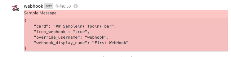
type にcustom_sample_postを持つ投稿が作成された場合、背景色が赤の投稿をレンダリングする例を以下に示します。今回は、Incoming Webhook で投稿を作成する際のパラメータとしてcustom_sample_postの独自 type を指定しています。
curl \
  -H "Content-Type: application/json" \
  -d '{"type": "custom_sample_post", "text": "Sample Message", "props": {"card": "## Sample\n* foo\n* bar"}}'  \
  http://localhost:8065/hooks/ucw5qjw86jgeum77o1uw8197jr
...
import CustomPost from './components/custom_post';

export default class Plugin {
    // eslint-disable-next-line no-unused-vars
    initialize(registry, store) {
		...
        // type: custom_sample_post を持つ投稿をレンダリングするComponentの登録
		registry.registerPostTypeComponent('custom_sample_post', CustomPost);
	}
}
...
import React from 'react';
import PropTypes from 'prop-types';

const {formatText, messageHtmlToComponent} = window.PostUtils;

const CustomPostComponent = ({post, theme}) => {
    const formattedText = messageHtmlToComponent(formatText(post.message));

    console.log('theme', theme);
    return (
        <div style={{backgroundColor: '#ffcccc'}}>
            {formattedText}
            <pre>
                {JSON.stringify(post.props, null, 4)}
            </pre>
        </div>
    )
}

CustomPostComponent.propTypes = {
    post: PropTypes.object.isRequired,
    theme: PropTypes.object.isRequired,
};

export default CustomPostComponent;
独自の type を指定した投稿を作成した後に Plugin を無効にするなど、type に対応した Component が登録されていない場合は、通常の投稿と同じようにレンダリングされます。
registerPostCardTypeComponent
registerPostCardTypeComponentは、特定の type を持つ投稿のcard要素をレンダリングする時に使用される Component を登録します。投稿(Post)に独自の type を指定する場合、その type はcustom_で始まる必要があります。
登録した Component は以下の props を受け取れます。
post: 投稿の内容 post.gotheme: Mattermost 画面の配色テーマ constants.jsx
type にcustom_sample_cardを持つ投稿が作成された場合、背景色が青のカード要素を持つ投稿をレンダリングする例を以下に示します。custom_sample_cardという独自 type は Incoming Webhook のパラメータとして指定しています。
curl \
  -H "Content-Type: application/json" \
  -d '{"type": "custom_sample_card", "text": "Sample Message", "props": {"card": "## Sample\n* foo\n* bar"}}'  \
  http://localhost:8065/hooks/ucw5qjw86jgeum77o1uw8197jr
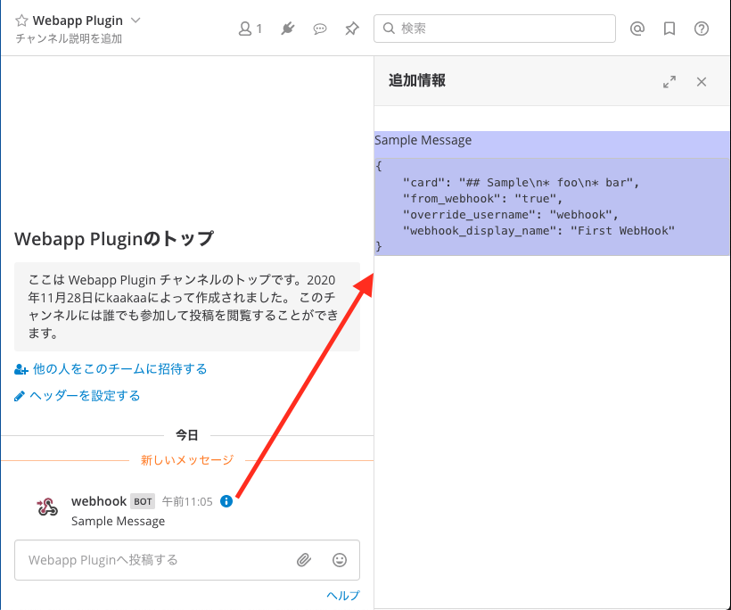
作成する投稿にprops.cardプロパティがない場合、card要素を表示するためのiボタンが表示されないためカード要素を表示することができません。必ずprops.card要素を指定する必要があります。
...
import CustomCard from './components/custom_card';

export default class Plugin {
    // eslint-disable-next-line no-unused-vars
    initialize(registry, store) {
		...
        // type: custom_sample_card を持つ投稿をレンダリングするComponentの登録
        registry.registerPostCardTypeComponent('custom_sample_card', CustomCard);
	}
}
...
import React from 'react';
import PropTypes from 'prop-types';

const {formatText, messageHtmlToComponent} = window.PostUtils;

const CustomCardComponent = ({post, theme}) => {
    const formattedText = messageHtmlToComponent(formatText(post.message));

    console.log('theme', theme);
    return (
        <div style={{backgroundColor: '#ccccff'}}>
            {formattedText}
            <pre>
                {JSON.stringify(post.props, null, 4)}
            </pre>
        </div>
    )
}

CustomCardComponent.propTypes = {
    post: PropTypes.object.isRequired,
    theme: PropTypes.object.isRequired,
};

export default CustomCardComponent;
独自の type を指定した投稿を作成した後に Plugin を無効にするなど、type に対応した Component が登録されていない場合は、通常の投稿と同じようにレンダリングされます。
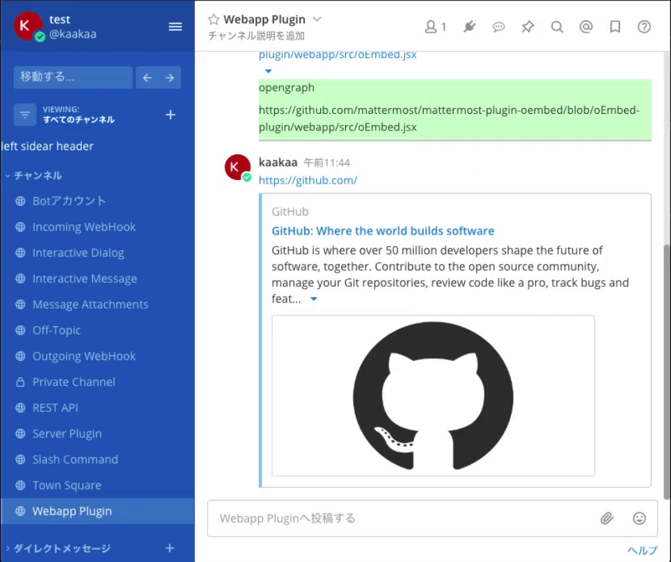
registerPostWillRenderEmbedComponent
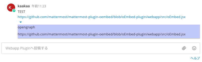
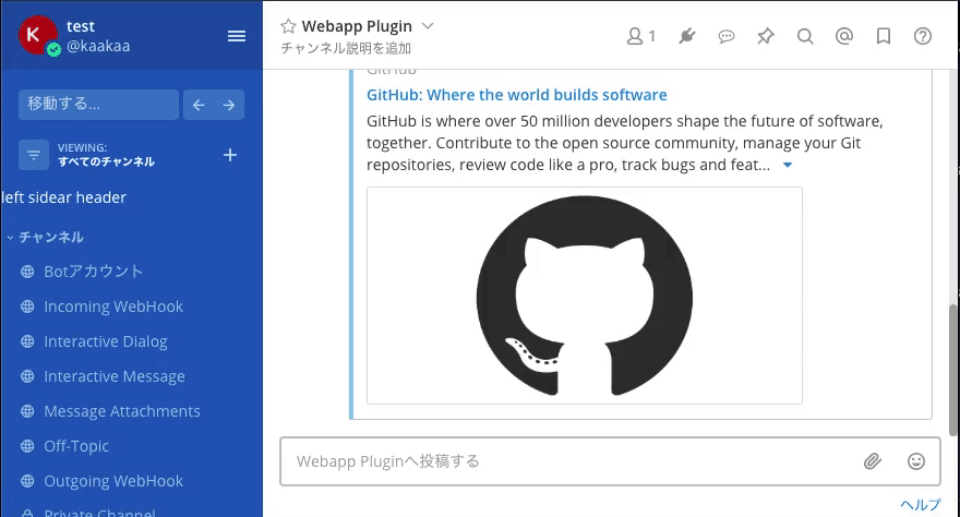
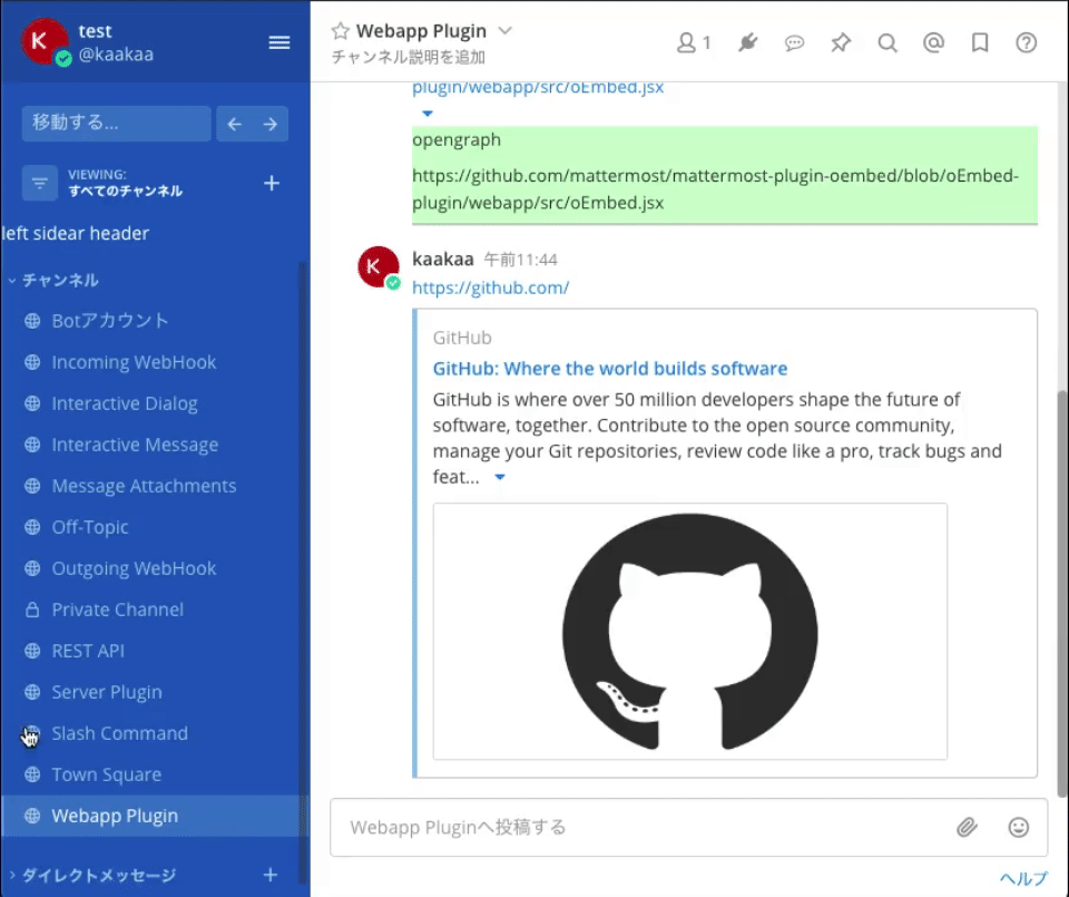
registerPostWillRenderEmbedComponentは、投稿内で最初に出現する URL の内容をプレビュー表示する部分のコンポーネントを登録します。OpenGraph の情報を表示するアレです。
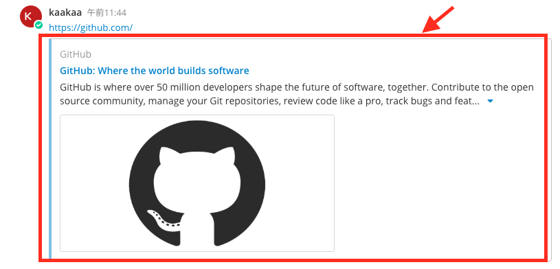
registerPostWillRenderEmbedComponentは 3 つの引数を取ります。
match: ここで指定したコンポーネントでプレビュー要素をレンダリングするかどうかを決定するための関数。プレビュー表示対象の URL や種別を使い、trueを返すとここで指定したコンポーネントを使用する。component: プレビュー要素をレンダリングするコンポーネントtoggleable: プレビュー要素を折り畳み可能にするかどうかのフラグ
また、登録したComponentは以下の props を受け取れます。
embed: 投稿の内容 post.gotype:urlから取得できるプレビューの種別。opengraphやimageなどの値が入るurl: 投稿ないで最初に出現する URLdata:urlから取得できるプレビュー内容に関する情報が格納されるらしいが、試している中では値が取得できなかった
https://github.com/mattermostで始まる URL が指定された場合に、青い背景色のプレビューをレンダリングする例を以下に示します。
...
import CustomEmbed from './components/custom_embed';

export default class Plugin {
    // eslint-disable-next-line no-unused-vars
    initialize(registry, store) {
		...
        // 投稿に含まれるURLのプレビューをレンダリングするComponentの登録
        registry.registerPostWillRenderEmbedComponent(
            (embed) => embed.url && embed.url.startsWith(`https://github.com/mattermost/`),
            CustomEmbed,
            true
        );
    }
}
...
import React from 'react';
import PropTypes from 'prop-types';

const CustomEmbedComponent = ({embed}) => {
    const {type, url, data} = embed;
    return (
        <div style={{backgroundColor: '#ccffcc'}}>
            <p>{type}</p>
            <p>{url}</p>
            <pre>
                {JSON.stringify(data, null, 4)}
            </pre>
        </div>
    )
}

CustomEmbedComponent.propTypes = {
    embed: PropTypes.shape ({
        type: PropTypes.string.isRequired,
        url: PropTypes.string.isRequired,
        data: PropTypes.object.isRequired,
    })
};

export default CustomEmbedComponent;
以下のリポジトリのoEmbed-pluginブランチに、Mattermost 公式チームによるregisterPostWillRenderEmbedComponentを使用したプラグインの実装が残っています。(作りかけで止まっているようですが)
https://github.com/mattermost/mattermost-plugin-oembed/tree/oEmbed-plugin
registerMainMenuAction
registerMainMenuActionは、Mattermost のメインメニュー部分に独自のメニューを追加します。
registerPostWillRenderEmbedComponentは 3 つの引数を取ります。
text: メインメニューに表示される文字列か React Element を指定しますaction: メインメニューが選択された際に実行されるアクションを登録しますmobileIcon: モバイルアプリで表示されるアイコンを登録します(が、モバイルアプリだとメインメニュー表示されない…?)
モーダルを開くアクションが登録されたメインメニューを追加する例を以下に示します。
...
export default class Plugin {
    // eslint-disable-next-line no-unused-vars
    initialize(registry, store) {
		...
        // メインメニューを追加する
        registry.registerMainMenuAction(
            'Sample Main Menu',
            () => store.dispatch(openRootModal()),
            () => (<i className='icon fa fa-plug' style={{fontSize: '15px', position: 'relative', top: '-1px'}}/>)
        );
    }
}
...
registerChannelHeaderMenuAction
registerChannelHeaderMenuActionは、チャンネル名の部分をクリックした時に表示されるメニューに独自のメニューを追加します。
registerPostWillRenderEmbedComponentは 2 つの引数を取ります。
text: メニューに表示される文字列か React Elementaction: メニューが選択された際に実行されるアクション。実行されたチャンネルのチャンネル ID が渡されます。
モーダルを開くアクションが登録されたチャンネルヘッダーメニューを追加する例を以下に示します。
...
export default class Plugin {
    // eslint-disable-next-line no-unused-vars
    initialize(registry, store) {
		...
        // チャンネル名をクリックした際に表示されるメニューに独自メニューを追加する
        registry.registerChannelHeaderMenuAction(
            <i className='icon fa fa-plug' style={{fontSize: '15px', position: 'relative', top: '-1px'}}>{'Sample Menu'}</i>,
            (chnnelId) => store.dispatch(openRootModal())
        );
    }
}
...
registerPostDropdownMenuAction
registerPostDropdownMenuActionは、投稿に対するドロップダウンメニューに独自のメニューを追加します。
registerPostDropdownMenuActionは 3 つの引数を取ります。
text: メニューに表示される文字列か React Elementaction: メニューが選択された際に実行されるアクション。メニューが実行された投稿の PostID が渡されます。filter: メニューを表示するかどうかを決定する関数。実行された投稿の PostID が渡されます。
モーダルを開くアクションが登録されたドロップダウンメニューを追加する例を以下に示します。

...
export default class Plugin {
    // eslint-disable-next-line no-unused-vars
    initialize(registry, store) {
		...
        // 投稿に対するドロップダウンメニューに独自メニューを追加する
        registry.registerPostDropdownMenuAction(
            <i className='icon fa fa-plug' style={{fontSize: '15px'}}>{'Sample Post Menu'}</i>,
            (postId) => store.dispatch(openRootModal()),
            (postId) => { return true; }
        );
    }
}
...
registerPostDropdownSubMenuAction
registerPostDropdownSubMenuActionは、投稿に対するドロップダウンメニューにサブメニュー付きの独自のメニューを追加します。
まず、registerPostDropdownSubMenuActionは 3 つの引数を取ります。
text: メニューに表示される文字列か React Elementaction: メニューが選択された際に実行されるアクション。実行された投稿の PostID が渡されます。(しかし、クリックしても何も実行されないようです)filter: メニューを表示するかどうかを決定する関数。メニューが実行された投稿の PostID が渡されます。
registerPostDropdownSubMenuActionは、返り値として登録したアクションの ID と、サブメニューを登録するための関数を返します。ここで返される関数を使ってサブメニューを登録していきますが、この関数は 2 つの引数を取ります。
text: メニューに表示される文字列か React Elementaction: メニューが選択された際に実行されるアクション。メニューが実行された投稿の PostID が渡されます。
(サブメニューを登録する関数の第 3 引数としてfilterとなる関数を渡しても、特に効果はないようです)
モーダルを開くアクションが登録されたドロップダウンサブメニューを追加する例を以下に示します。
...
export default class Plugin {
    // eslint-disable-next-line no-unused-vars
    initialize(registry, store) {
		...
        // 投稿に対するサブメニュー付きのドロップダウンメニューを追加する
        const {id, rootRegisterMenuItem} = registry.registerPostDropdownSubMenuAction(
            <i className='icon fa fa-plug' style={{fontSize: '15px'}}>{'Sample SubMenu'}</i>,
            (postId) => store.dispatch(openRootModal()),  // 実行されない
            (postId) => { return true; }
        );
        rootRegisterMenuItem(
            <i className='icon fa fa-plug' style={{fontSize: '15px'}}>{'SubMenu 1'}</i>,
            (postId) => store.dispatch(openRootModal()),
        );
        rootRegisterMenuItem(
            <i className='icon fa fa-plug' style={{fontSize: '15px'}}>{'SubMenu 2'}</i>,
            (postId) => store.dispatch(openRootModal())
        );
    }
}
...
registerPostDropdownMenuComponent
registerPostDropdownMenuComponentは、投稿に対するドロップダウンメニューに独自のコンポーネントを追加します。
登録した Component は以下の props を受け取れます。
postId: アクションが実行された投稿の PostIDtheme: Mattermost 画面の配色テーマ constants.jsxdispatch: action を dispatch するための関数
モーダルを開くアクションが登録されたドロップダウンメニューを追加する例を以下に示します。

...
import CustomPostDropdown from './components/custom_post_dropdown';
...
export default class Plugin {
    // eslint-disable-next-line no-unused-vars
    initialize(registry, store) {
		...
        // 投稿に対するドロップダウンメニューにコンポーネントを登録する
        registry.registerPostDropdownMenuComponent(CustomPostDropdown);
		...
	}
}
import React from 'react';
import PropTypes from 'prop-types';

import {openRootModal} from 'actions';

const CustomPostDropdownComponent = ({postId, theme, dispatch}) => {
    return (
        <div
            style={{backgroundColor: '#ffcccc'}}
            onClick={() => dispatch(openRootModal())}
        >
            {postId}
        </div>
    )
}

CustomPostDropdownComponent.propTypes = {
    postId: PropTypes.string.isRequired,
    theme: PropTypes.object.isRequired,
    dispatch: PropTypes.func.isRequired,
};

export default CustomPostDropdownComponent;
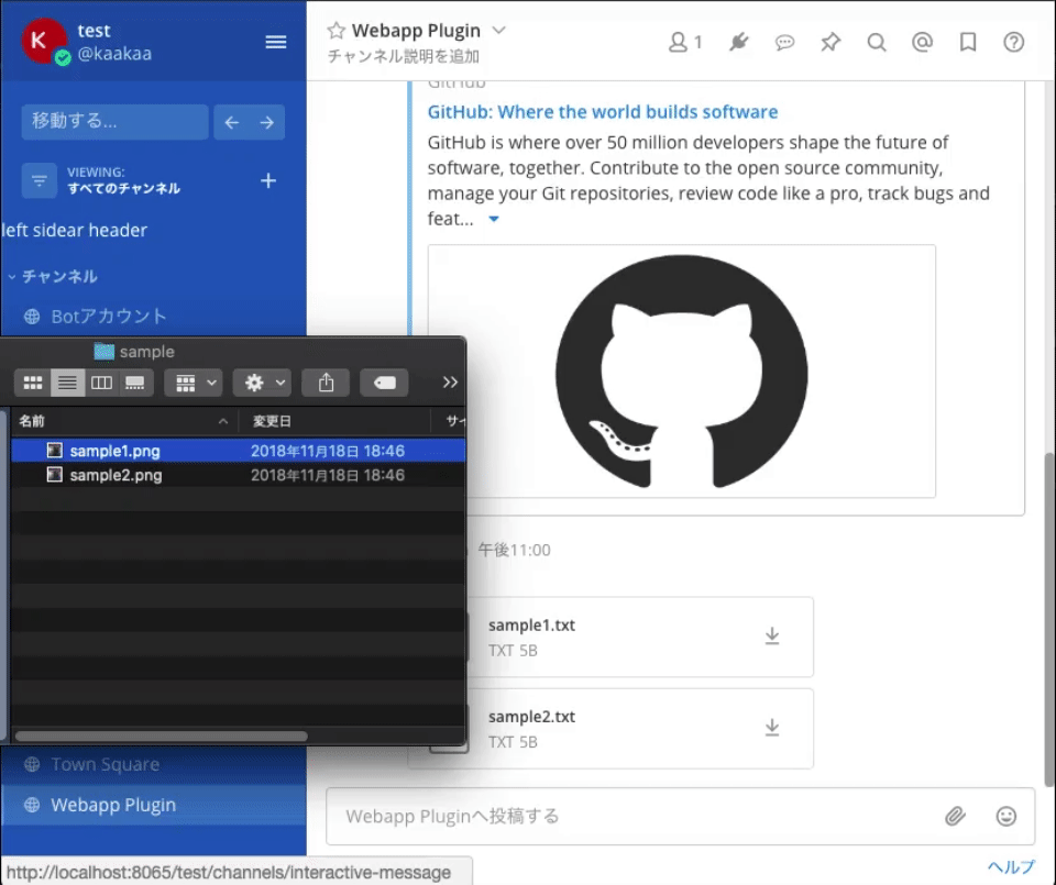
registerFileUploadMethod
registerFileUploadMethodは、ファイルアップロードメニューに独自のメニューを追加します。
registerFileUploadMethodは 3 つの引数を取ります。(公式ドキュメントは引数の順序が違っているので注意)
icon: JSX 形式のメニューに表示されるアイコンaction: メニューが選択された際に実行されるアクション。ファイルをアップロードするための関数が渡されます。text: メニューに表示されるテキスト
メニューが選択されると、テキストファイルが 2 つアップロードされる例を以下に示します。
...
export default class Plugin {
    // eslint-disable-next-line no-unused-vars
    initialize(registry, store) {
		...
        // ファイルアップロードメニューを追加する
        registry.registerFileUploadMethod(
            <i className='icon fa fa-pencil-square-o' style={{fontSize: '15px'}}/>,
            (upload) => upload([
                new File(["test1"], "sample1.txt"),
                new File(["test2"], 'sample2.txt')
            ]),
            'Sample File Upload'
        );
    }
}
...
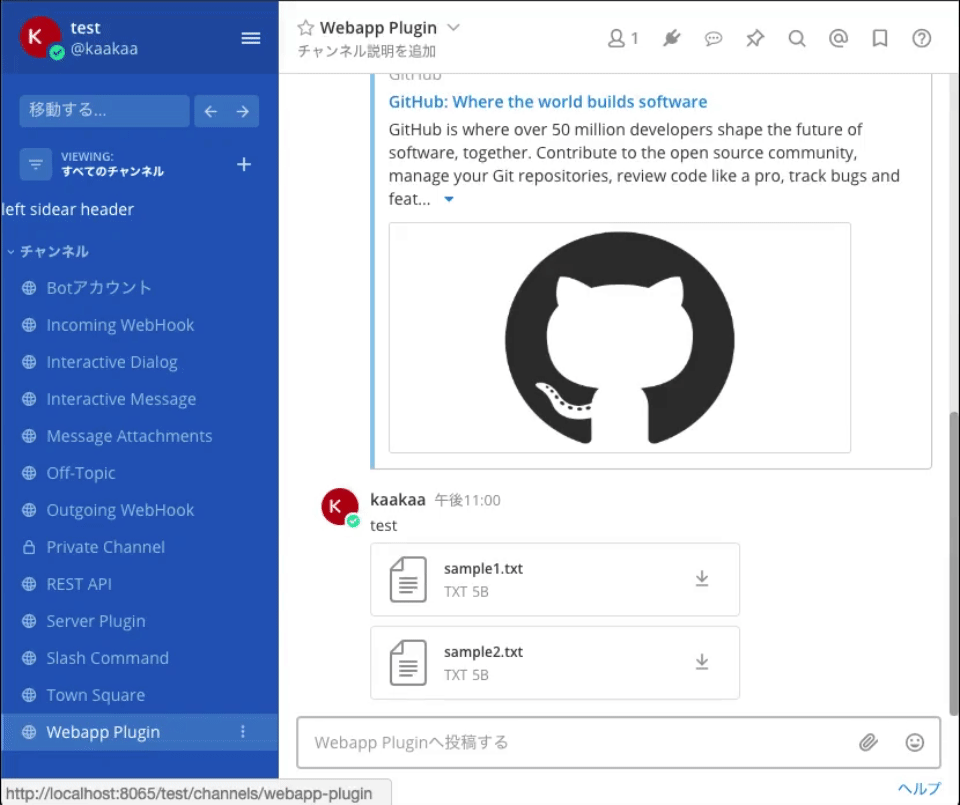
registerFilesWillUploadHook
registerFilesWillUploadHookは、ファイルアップロード時に実行される関数を登録できます。
registerFilesWillUploadHookは 2 つの引数を取る関数を引数に取ります。
files: アップロードしようとしているファイルの配列upload: ファイルをアップロードするための関数- この関数を使わなくとも、アップロードしたいファイルを返却値として指定することでファイルをアップロードできます
返り値として以下のフィールドを持つオブジェクトを返却する必要があります。
message: 処理結果として画面に表示されるメッセージを指定しますfiles: 処理結果としてアップロードするファイルを配列として指定します。nullを指定するとアップロードを reject します。
2 つ以上のファイルを同時にアップロードしようとするとアップロードを reject する例を以下に示します。
...
export default class Plugin {
    // eslint-disable-next-line no-unused-vars
    initialize(registry, store) {
		...

        // ファイルアップロード時の処理を登録する
        registry.registerFilesWillUploadHook((files, upload) => {
            let msg = '';
            if (files.length >= 2 ) {
                files = null;
                msg = 'Must upload one by one.';
            }
            return {
                message: msg,
                files: files,
            };
        });
    }
}
...
unregisterComponent
unregisterComponentは、プラグインとして登録した Component や Hook を登録から除外します。
registerLeftSidebarHeaderComponentによって登録したコンポーネントを登録から除外するメインメニューの例を以下に示します。
...
export default class Plugin {
    // eslint-disable-next-line no-unused-vars
    initialize(registry, store) {
		...
        // 左サイドバーの上部に表示されるComponentの登録
        const leftSidebarHeaderComponentId = registry.registerLeftSidebarHeaderComponent(LeftSidebarHeader);
        ...
        // プラグインによって登録されたコンポーネントを登録から除外する
        registry.registerMainMenuAction(
            'Unregister LeftSideberHeader',
            () => registry.unregisterComponent(leftSidebarHeaderComponentId),
            () => (<i className='icon fa fa-plug' style={{fontSize: '15px', position: 'relative', top: '-1px'}}/>)
        );
    }
}
...
unregisterPostTypeComponent
unregisterPostTypeComponentは、unregisterComponentと同様、独自のPostTypeに対して設定した Component を登録から除外します。
例は省略します。
registerReducer
registerReducerは、プラグイン内で使用する Reducer を登録します。
ここまでに紹介してきた例では、モーダルを開くアクションが実行された場合などにregisterReducerによって登録された reducer を利用しています。
...
import reducer from './reducer';
...
export default class Plugin {
    // eslint-disable-next-line no-unused-vars
    initialize(registry, store) {
		...
        // Reducerを登録する
        registry.registerReducer(reducer);
    }
}
import {combineReducers} from 'redux';

import {OPEN_ROOT_MODAL, CLOSE_ROOT_MODAL} from './action_types';

const rootModalVisible = (state = false, action) => {
    switch (action.type) {
    case OPEN_ROOT_MODAL:
        return true;
    case CLOSE_ROOT_MODAL:
        return false;
    default:
        return state;
    }
};

export default combineReducers({
    rootModalVisible,
});
import {id as pluginId} from './manifest';

export const OPEN_ROOT_MODAL = pluginId + '_open_root_modal';
export const CLOSE_ROOT_MODAL = pluginId + '_close_root_modal';
さいごに
本日は、Mattermost Plugin のWebappサイドの実装について紹介しました。 明日は、残りのWebappサイドの API を紹介していきます。